
I accidentally built the format LinkedIn's algorithm is rewarding right now
The algorithm data behind my 2,000+ saves

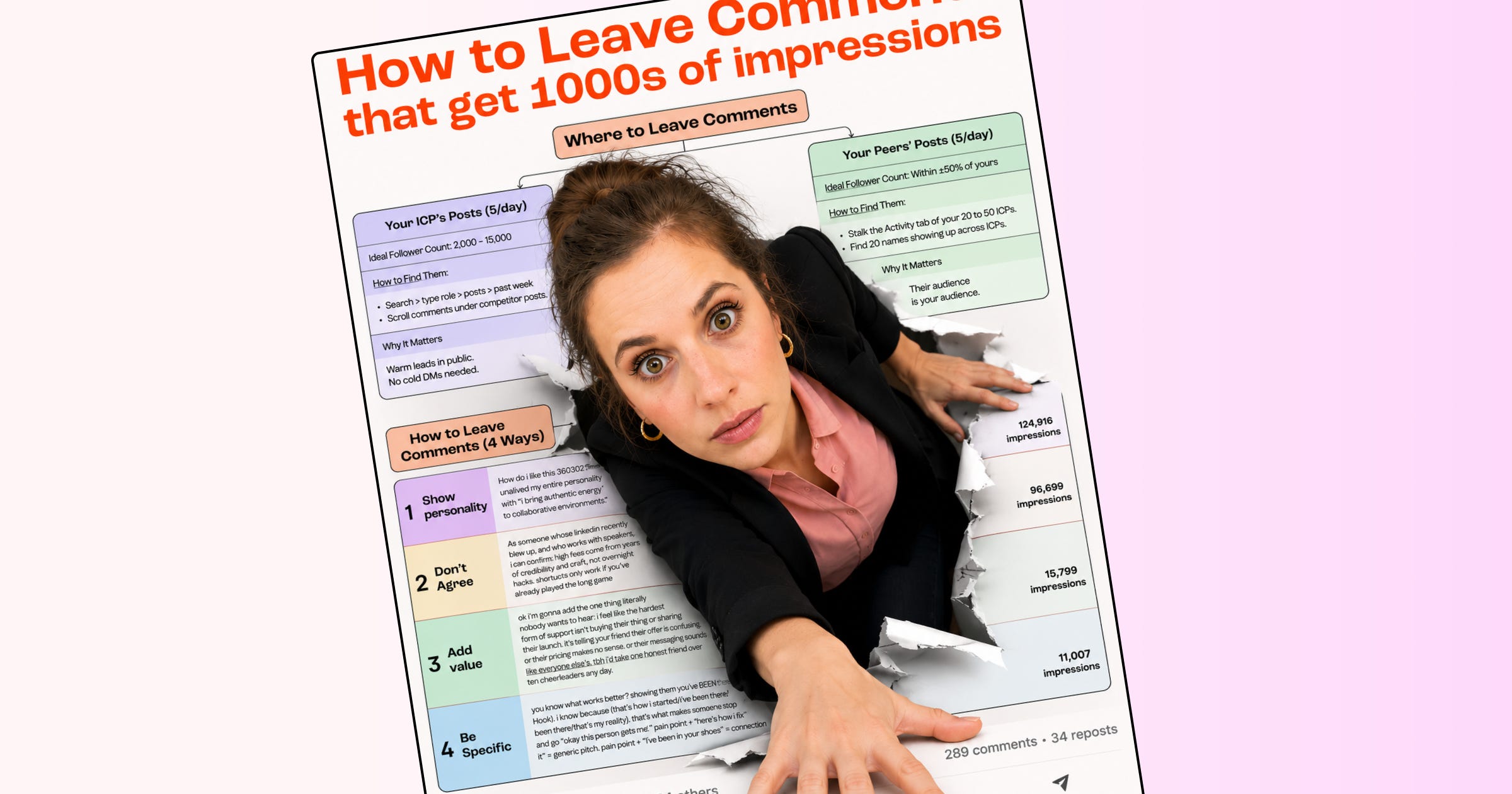
I’ve always wanted to be special. So when Vince and I started working together two months ago, I refused to do what 90% of LinkedIn does:
AI-generated infographics
Recycled frameworks everyone has seen a thousand times
Carousels that look like someone’s intern made them at gunpoint
Hook templates copied from the same 5 viral accounts
We had no grand plan. I’d write a post, he’d animate the framework into a looping GIF, we’d publish it, see what happened.
Then something weird happened.
The animated infographics started outperforming some of my best personal posts of ALL TIME. Everything except the deeply personal stories that take a piece of me to publish.
One animated infographic pulled 2,262 saves, 102 sends, and 551 new followers. In two weeks. On a platform where 57% of posts are image posts and most of them get a polite like and disappear.
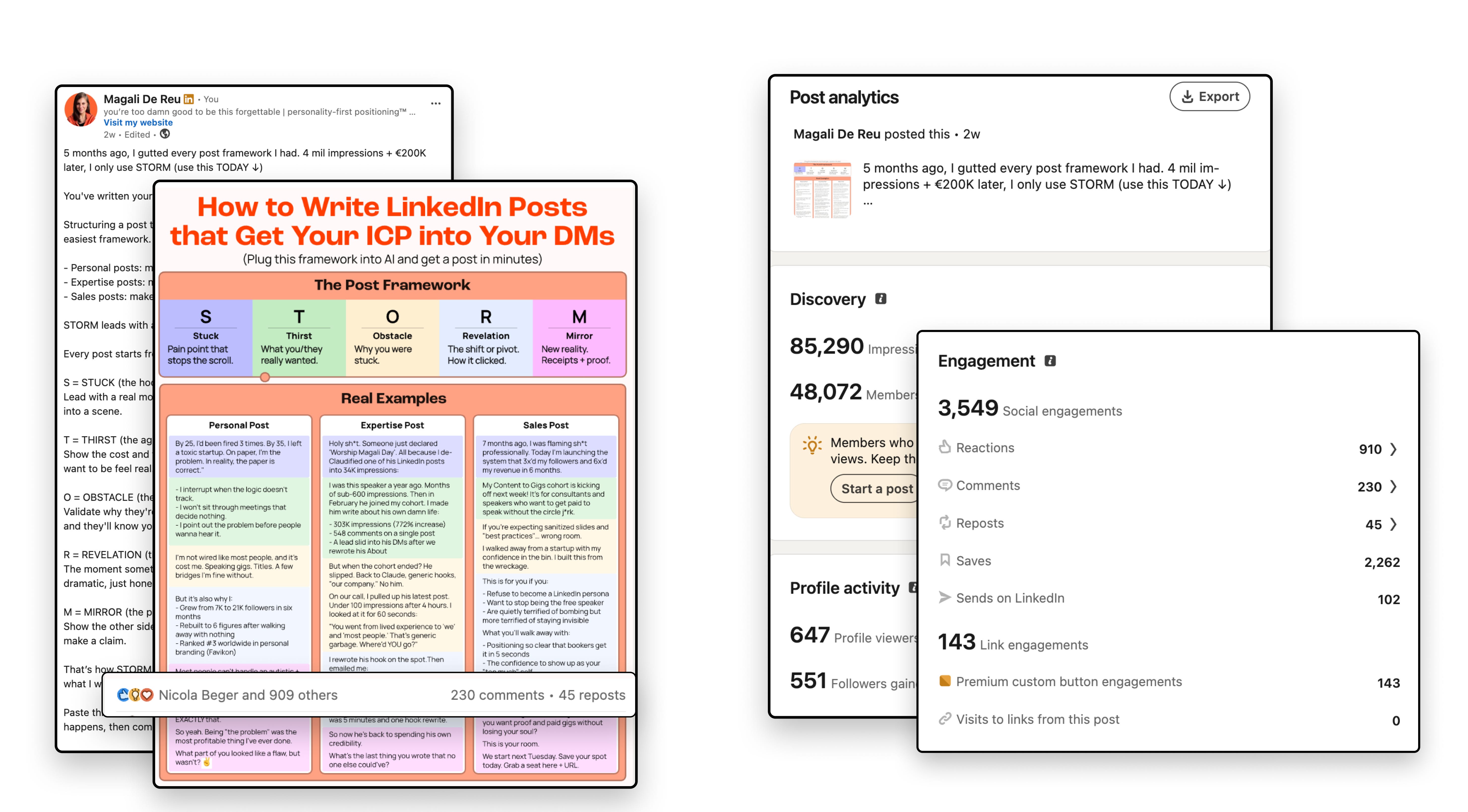
Of course my neurodivergent brain had to understand why.
So I pulled the data, cross-referenced it with Richard Van Der Blom’s 2026 Algorithm Insights Report and AuthoredUp’s 1.3M post regression model, and found something I didn’t expect.
We’d built the exact format the algorithm is optimized to reward. By accident.
The two signals that outrank everything in 2026
The distribution model changed. Likes used to be the primary engagement signal. Now two behaviors outrank them: saves and sends.
Saves mean “I need this again.” Sends mean “someone else needs to see this.”
A post with 50 saves reaches more people than a post with 200 likes.
A post that gets DM-forwarded to 10 people gets pushed wider than a post with 30 comments full of fire emojis.
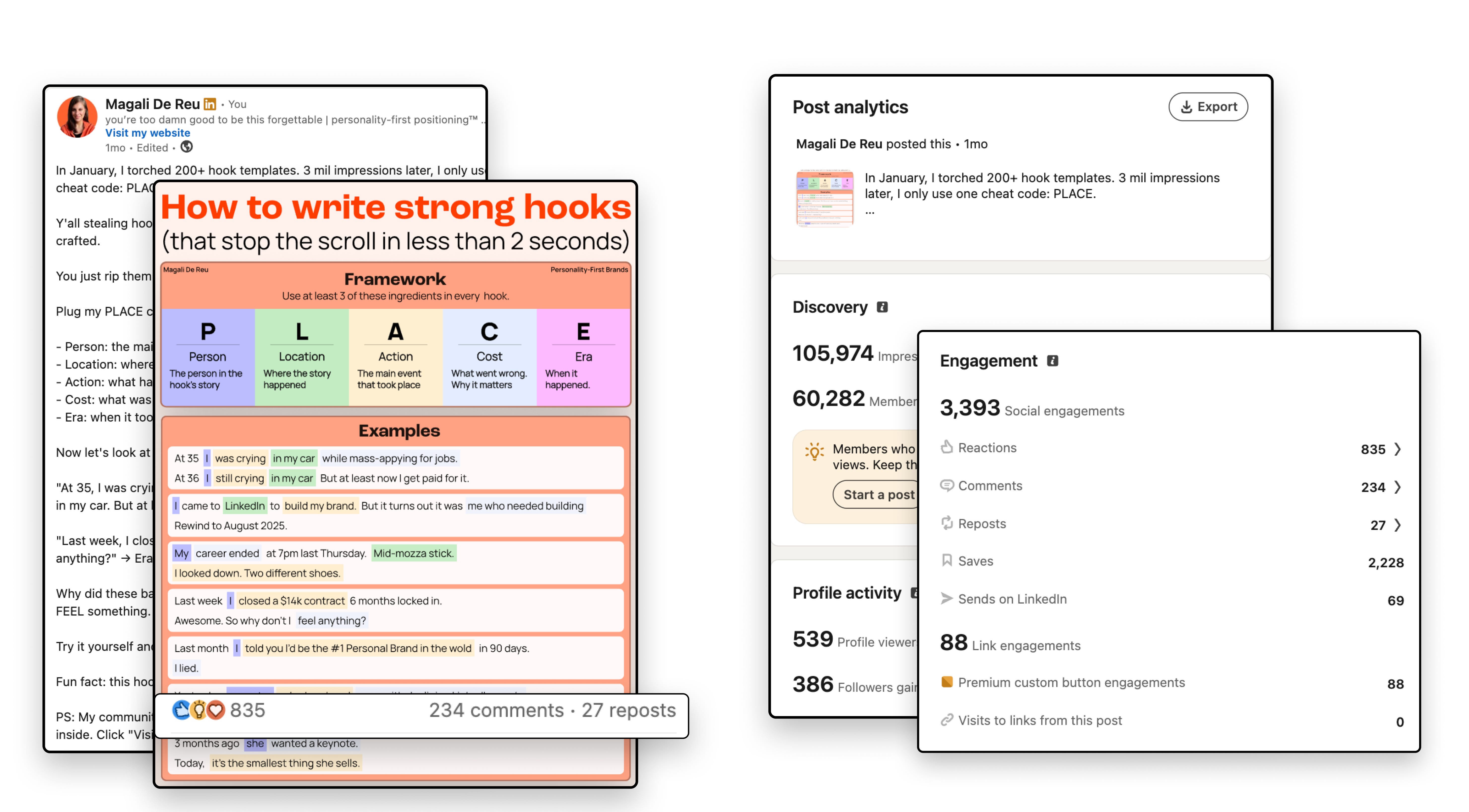
One of our animated infographics got 2,228 saves and 69 sends.
That single post gained 386 followers.
Not from going viral in the traditional sense. From triggering the two signals the algorithm weights most.
So what makes someone hit save?
The post has to be specific enough to use later. A framework they’ll reference for a project next week. Numbers they want to check against their own results. A checklist they’ll screenshot for their team. A process they’ll pull up on a ra afternoon when they’re stuck.
If your infographic makes someone think “interesting” but they keep scrolling, the algorithm clocks that as low-intent engagement. If they save it to use later, that’s a quality signal, and your post gets resurfaced to people with similar interests.
Sends work the same way, plus relevance to someone else.
“My colleague needs to see this.”
“This is exactly what we talked about in the meeting.”
Both signals have the same trigger: pain. When your infographic names a specific problem your reader is living through right now, the save is automatic.
Your reader doesn't sit there weighing the pros and cons of tapping a bookmark icon. Their body says 'I need this' before their brain catches up.
The report’s clearest line on this: generic education is what audiences are tuning out in 2026. Posts featuring original evidence and specific outcomes outperform generic thought leadership by 45% on engagement. LinkedIn detects structurally generic content and down-ranks it. The anti-slop signal is an active distribution factor now.
Your “5 tips for better marketing” infographic? The algorithm sees a thousand of those a day. It’s bored of your tips. We all are.
But saves and sends only happen if someone stops long enough to process what they’re looking at. That’s dwell time. And that’s where animation enters the picture.
What animation does to dwell time
I went down the rabbit hole on this. Fair warning, I'm still in it.
Your brain is hardwired to notice movement. Motion-detection neurons fire before conscious thought kicks in. Your LinkedIn feed is all static images and text. One moving element breaks the pattern and forces a stop. You don’t choose to look. Your brain does it for you.
GIFs uploaded as images on LinkedIn autoplay and loop silently. No progress bar or play button here. They start moving the moment they hit the viewport. In a feed full of AI visuals and sloppy infographics? That’s a cheat code.
A static infographic gets glanced at. An animated one holds the eye through the full loop. TikTok’s data shows videos with fast motion in the first 2 seconds outperform others by up to 27% in engagement. Same principle applies in a feed. Except on LinkedIn, almost nobody is doing it. So the bar is on the floor.
And here’s where it gets interesting for the data nerds (hi, it’s me, I’m the data nerd).
Dwell time is a distribution signal. The algorithm measures how long someone stays on your post before scrolling. An animated infographic looping for 8 to 12 seconds generates way more dwell time than a static image someone processes in 2. You’re buying yourself 4x the attention window without asking anyone’s permission.
Completion matters even more than duration. The report says “shorter, tighter, and fully consumed always outperforms longer and half-read.” In the case of a carousel (not relevant for our format), a tight 8-slide deck where readers finish outperforms a 20-slider they abandon at slide 4. Sub-35% completion rate triggers an 80% visibility penalty. That’s a death sentence for your post.
Vince builds high-density infographics where every element earns its place. More value per pixel. People finish it because nothing is filler. They slow down because every line is worth reading. And the algorithm scores both behaviors.
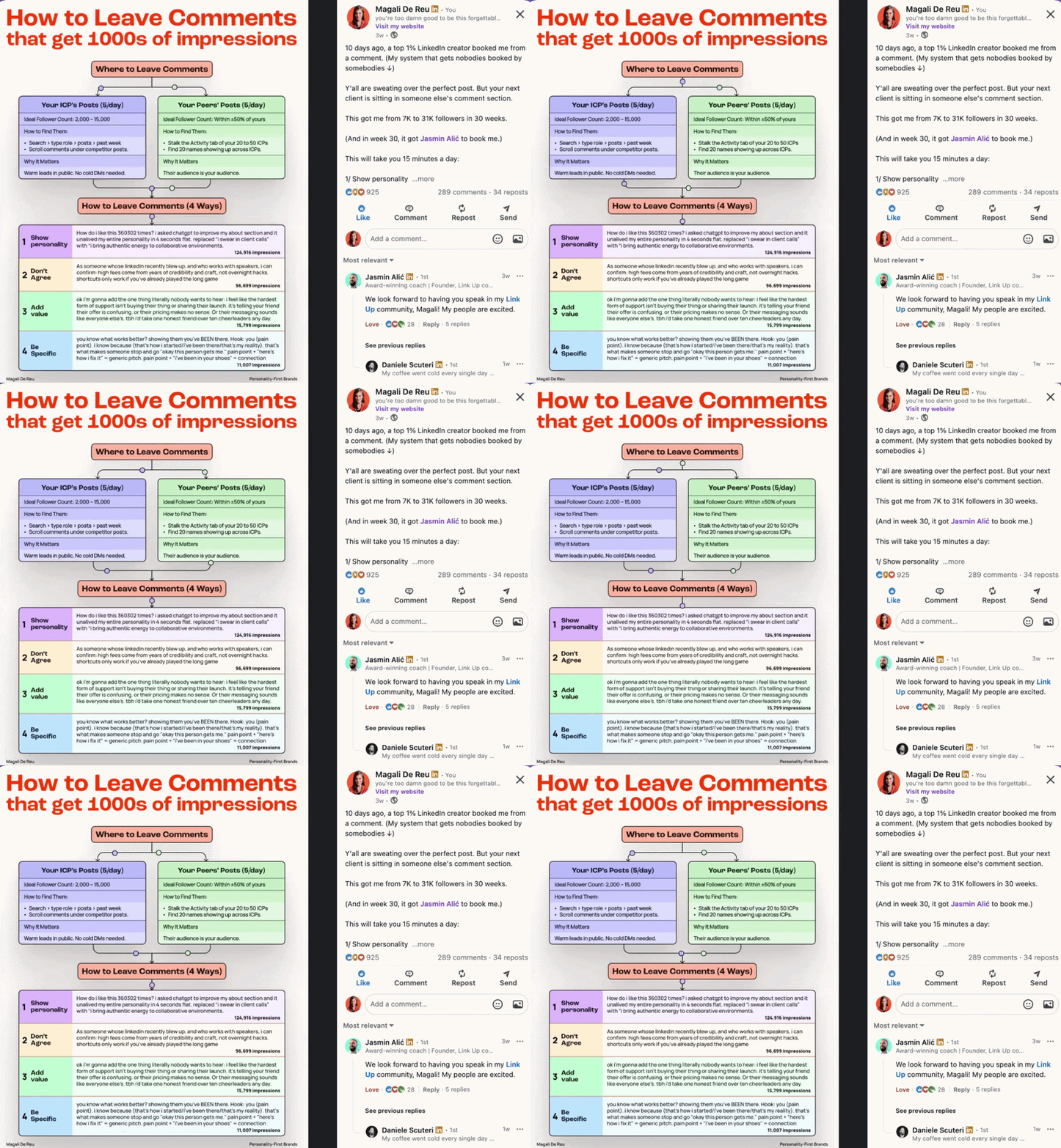
What I personally didn’t know (and felt dumb about later): LinkedIn classifies GIFs as image posts. You start from the same baseline as any image post, the 20% reach bump and the extra engagement.
On paper, you’re posting an image. In practice, you’re generating video-level dwell time in a category where almost NOBODY else uses motion.
So yeah. Animation gets people to stop. Good writing is what makes them stay. And I do mean good writing. Not a Claude skill or some AI prompt, because your audience knows.
Write from your own experience, in your own voice.

What a personality-first hook does to distribution
Your hook is the only element the algorithm scores BEFORE anyone engages.
Kinda crazy, right? Before a single human being decides whether your post is worth reading, the algorithm already made a judgment call based on your first line.
LinkedIn evaluates your hook before deciding how many people to show it to. A weak hook means a smaller initial distribution batch. A strong hook means a wider one.
For the past 2 years, everyone has been recommending the same hooks:
Does {popular belief}? I think not.
You don’t have an A problem. You have a B problem.
Here’s the truth nobody tells you about [topic].
5 things I wish I knew about [topic] sooner.
Sameness again. Don’t be that person. It’s your one-way ticket to forgettable city.
What works? Personal hooks grounded in lived experience. They outperform generic hooks by 3x. Format-independent. Whether it's a text post or an animated infographic, the hook multiplier holds.
Now, not everyone's a writer. Which is why I designed the PLACE framework, to give you a structure instead of a blank page. It stands for Person, Location, Action, Cost, Era. A good hook needs at least three of those five, plus tension. I wrote a full breakdown of how to apply it.
It's easy to tell the difference between a generic hook and one grounded in lived experience:
Generic: “Here’s the truth about LinkedIn content strategy.”
Lived experience: “I spent 3 months rebuilding a client’s brand from scratch. Here’s the 5-step framework that came out of it, with the numbers.”
That specificity earns a wider initial distribution batch because the algorithm reads it as original, not templated.
You’re basically telling the system: this is a real person with a real story, not another prompt-generated post.
When you pair a personality-first hook with an animated visual, you stack two signals:
Your hook earns a wider initial distribution batch
Animation earns longer dwell time once people land on the post.
Both signals fire at once, and the algorithm pushes harder.
When was the last time you wrote a hook that could ONLY come from you?
What you’re known for > what you know
A wider distribution batch is only useful if the algorithm knows where to send your content. That’s where Topic Authority comes in.
Every post you publish gets a fingerprint built from its language, topics, media type, and early engagement patterns. When that fingerprint matches a reader’s interest profile, the post gets routed to their feed, whether they follow you or not.
LinkedIn calls this the Interest Graph, and the numbers tell the story:
→ In 2024, 72% of your reach came from your direct connections.
→ In 2026, that dropped to 31%. Almost 70% of your distribution now goes to strangers who share your topic interests.
Think about that next time you hit publish. Seven out of ten people who see your post don’t follow you. LinkedIn is a topic platform now. What you’re known for decides how far your content travels.
So how do you build that Topic Authority? Post consistently about one topic, and your posts stay visible up to 40% longer than posts from scattered profiles. The algorithm reads your body of work. If a stranger lands on your profile and can tell in one sentence what you’re about, your Topic Authority score goes up. If they can’t, it goes down.
A less saturated topic gives you an automatic advantage on top of that. When nothing else in the feed covers your specific angle, the algorithm routes you first.
This is where animated infographics come back in. When they deliver specific frameworks in a consistent niche, they build Topic Authority fast. Each one reinforces the same fingerprint. Each one tells the algorithm: this person knows this subject, and people who care about this subject engage with their content.
Volume without specificity dilutes the signal. Specificity without volume still works, because the algorithm rewards depth over breadth.
The format anomaly
So what happens when all of these signals fire at the same time?
Vince’s design formula has 4 criteria:
big pain point (your audience has to feel it = saves)
immediately actionable (they have to be able to apply this the next day)
less saturated topic (opens interest clusters with zero competition)
high density (every element earns its place = keeps dwell time up.)
Pair that with a personality-first hook and animation, and you trigger every signal the Interest Graph rewards at once: saves, sends, completion, dwell time, and topic authority.
That’s why our infographics outperform generic ones. Same format. Different signal profile.
We built this by accident. Vince animates, I write personality-first.
Together, the format stacks every signal LinkedIn’s 2026 algorithm rewards.
TL;DR: Vince and I accidentally created a format anomaly.
Animated expertise + personality-first writing.
The algorithm has no crowded category to compare this against.
What this means for you
You’ve read the data. You’ve seen the numbers. Now the uncomfortable question: what are you going to do with it?
Design content fails on LinkedIn when it’s generic and disconnected from a real voice.
This format works because motion holds attention, personality earns distribution, specificity triggers saves, and topic consistency builds authority over time.
You don’t need to be a Figma designer.
You don’t even need to learn Jitter (the tool that animates the infographic).
You do need a format that gives the algorithm what it’s asking for: completion, dwell time, saves, sends, and a clear topic signal.
Right now, almost nobody is combining animation with personality-first writing on LinkedIn. That won’t last.
We’re showing exactly how we build this, start to finish, in a live workshop on June 4th. Because this format works too well to keep it between two people.
Vincent designs a viral animated infographic from scratch. I write the post. You watch the process happen in real time, then take it home. And you leave with 3 of our viral templates so you can test the format yourself the same week.
We’re keeping this small. Spots are limited.
What’s the best-performing format in your feed right now? Hit reply. I want to see what’s working outside my bubble.
It'd be great if you showed how to create animated infographics
Magali, the main reason I save infographics is that they're difficult to read on a phone so I check them out later on my laptop. But I'm doing that less and less now because most of them are rehashes of the same information so i can see where animated infographics might outperform competition.